Implementing a Popper That Follows a Text Selection Area
Utilizing the concept of Virtual Elements to address popper positioning issues and properly handling mouse events are key to flawlessly realizing this functional component.
Requirement Analysis
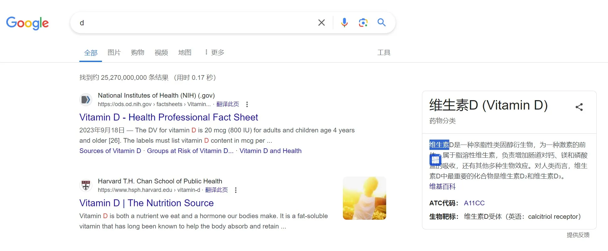
The requirement is to display an icon beneath a selected piece of text, with the icon’s click event triggering an API call to fetch and display the definition of the selected word(s). The original project utilized the jQuery UI library webui-popper , but this implementation utilizes Vue 3 in conjunction with the UI library element-plus for the rewrite.

Conventional Usage of el-popper
Conventionally, el-popper is attached to a specific element serving as its reference:
<el-popover :visible="visible" placement="bottom" title="Title" :width="200" content="this is content, this is content, this is content" > <template #reference> <el-button class="m-2" @click="visible = !visible" >Manual to activate</el-button > </template> </el-popover>It is worth noting that el-popper is essentially a wrapper around popper.js, now upgraded to floating-ui. The official documentation provides inspiration, particularly the use of virtual element.
Handling Virtual Elements
The initial intuition is to encapsulate the selected text within a tag, treating it as a virtual element and also serving as the el-popper reference:
<template #reference> <!-- 触发弹出层的元素 --> <span ref="selectedTextRef">{{ selectedText }}</span> </template>Crucially, this virtual element must provide positional information through its getBoundingClientRect method. This can be achieved quite straightforwardly:
selectedTextRef.value!.getBoundingClientRect = () => { const selection = window.getSelection() const range = selection!.getRangeAt(0) const rect = range.getBoundingClientRect() // 考虑滚动偏移 rect.x += window.scrollX rect.y += window.scrollY return rect }Displaying the Icon
With the positioning and popper display resolved, let’s incorporate the icon:
<el-popover :visible="visible" placement="bottom" title="Title" :width="200" :show-arrow="false" :popper-class="customPopperClass" > <div style="width: 25px; height: 25px;"> <img v-if="showIcon" :src="iconSrc" style="max-width: 25px; border-radius: 5px; opacity: 0.8; cursor: pointer;"> </div> <template #reference> <span ref="selectedTextRef">{{ selectedText }}</span> </template> </el-popover>Although the icon is now displayed, it appears enclosed within a modal-like container, which does not meet our desired effect.
Resolving Encapsulation Styles
To address this issue, follow these steps:
- Remove the arrow: :show-arrow=“false”
- Make the wrapping element transparent: :popper-class=“customPopperClass”, then define the custom styles:
<style lang="scss">/* 自定义弹出层样式 */.customPopperClass { background: transparent !important; border: none !important; box-shadow: none !important; padding: 0 !important; width: 15px !important;}</style>Solving Auto-Dissipation Issue
After displaying the icon, we do not want the popper to disappear automatically; thus, we need to change its trigger mode to ‘manual’. For newer versions of element-plus, omitting the trigger attribute is equivalent to ‘manual’ (this detail is not clearly documented, discovered through encountering issues and examining the source code).
Currently, the implemented approach does not prevent the popper from disappearing. Using trigger=“click” works, but considering our usage of a virtual element, introducing a click-based trigger could introduce other complications. As a compromise, set a sufficiently long display duration: :hide-after=“1000000”
Additionally, we need to handle the finer details of disappearance—specifically, closing the popper when clicking outside of it.
For this purpose, we will utilize vueuse:
pnpm install @vueuse/coreWe’ll then determine whether the click event occurs within the popper area:
import { onClickOutside } from '@vueuse/core'
onClickOutside(popoverRef, (event) => {  if (isPointerInRect(event, selectedTextRef.value?.getBoundingClientRect())) {    console.log('pointer on top of selected text')    return  }})
We include the isPointerInRect check to ensure that clicking on the selected text itself does not close the popper:
// 比较鼠标位置是否在矩形内function isPointerInRect(event: PointerEvent, rect: DOMRect | undefined): boolean { if (rect === undefined) return false const pointerX = event.clientX const pointerY = event.clientY return ( pointerX >= rect.left && pointerX <= rect.right && pointerY >= rect.top && pointerY <= rect.bottom )}Conclusion
Implementing this component is not overly complex, and the process introduced new concepts such as Virtual Elements and getBoundingClientRect. It was an enjoyable learning experience, hence this write-up.
BTW,
During most of the time spent developing this solution, I relied on the plugin TONGYI Lingma. Many of its suggestions were directly applicable. However, for more accurate responses, it is best to specify requirements like using <script setup lang=“ts”> for component encapsulation, as it defaults to providing Vue 2 syntax.